Tips for Choosing Calm Colors for Your Home
Creating a serene and inviting atmosphere in your home begins with your choice of colors. Calm colors have the power to influence mood, promote relaxation, and improve the overall feel of your living space. Whether you want to refresh a single room or repaint your entire home, selecting tranquil hues is a wonderful way to foster a peaceful environment.
In this post, we’ll explore practical tips for choosing calm colors that align with your style and needs.
Why Choose Calm Colors?
Calm colors are typically soft, muted, or pastel shades that help reduce stress and create a feeling of harmony. They often include colors inspired by nature, such as blues, greens, and neutrals. By using these colors, you can:
– Enhance relaxation and comfort
– Make spaces feel more open and airy
– Create a timeless, elegant appeal
Now, let’s dive into how to pick the perfect calm colors for your home.
Understand the Psychology of Colors
Colors have distinct effects on our emotions and mindset. Here are common calm color options and what they represent:
– Blue: Often associated with tranquility and stability, blue helps slow the heart rate and reduce anxiety. It’s ideal for bedrooms or bathrooms.
– Green: Symbolizing nature and balance, green is refreshing and restful for the eyes. It suits living rooms or home offices.
– Lavender and Soft Purples: These promote relaxation and creativity while adding a subtle touch of elegance.
– Neutral Tones (beige, taupe, gray): Neutral colors create a calming backdrop and pair well with almost any accent color.
– Soft Pinks: Gentle pinks can bring warmth and a soothing vibe to a space without being overpowering.
Choosing colors based on their psychological impact can guide you toward creating a calming setting.
Consider the Lighting in Your Space
Lighting greatly influences how colors look and feel in a room. Here’s what to keep in mind:
– Natural Light: Colors generally appear brighter and more vibrant in natural light. South-facing rooms tend to get warm light, flattering warmer color tones, while north-facing rooms have cooler light, complementing cooler colors.
– Artificial Lighting: The type of artificial bulbs (warm or cool) will also impact how the paint appears after dark.
– Test Samples: Always paint test swatches on your walls and observe them at different times of day to see the full effect.
Keeping lighting in mind reduces surprises and ensures your chosen calm colors work beautifully in your space.
Choose a Color Palette That Works Together
To maintain calmness throughout your home—or within individual rooms—select colors that harmonize well.
– Monochromatic Palette: Use various shades and tints of a single calm color for a cohesive and serene look.
– Analogous Colors: Choose colors next to each other on the color wheel, such as blue and green, to create smooth transitions.
– Neutral with a Pop: Use soft neutrals as the base and introduce calm blues or greens as accent colors for visual interest without overwhelming.
Maintaining a thoughtful palette helps your space feel balanced and inviting.
Think About Room Function
Different rooms serve different purposes, which can influence your color choice:
– Bedrooms: Aim for the most relaxing colors, such as soft blues, lavender, or pale greens to promote restful sleep.
– Living Rooms: Warm neutrals and muted greens work well to foster conversation and comfort.
– Bathrooms: Light blues and sea greens evoke cleanliness and calm.
– Home Offices: Gentle greens or muted purples can encourage focus without causing distraction.
Match your calm colors to the room’s use to enhance both beauty and functionality.
Use Color in Layers and Textures
Adding calm colors doesn’t mean painting every surface the same shade. Incorporate calm hues in layers:
– Walls: Use your main calm color for walls to set the tone.
– Furniture: Choose sofas, chairs, or cabinets in complementary shades.
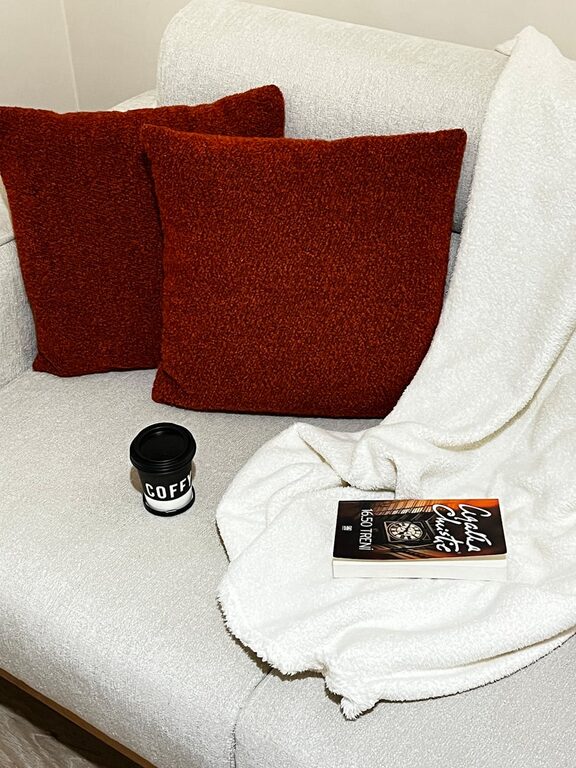
– Textiles: Pillows, curtains, rugs, and throws in calm colors contribute softness and dimension.
– Decor: Incorporate art, vases, or other accessories in your chosen palette to unify the space.
These layers make your home feel comfortable and thoughtfully designed.
Keep it Simple and Avoid Bright Overload
While bright colors can energize a room, they may disrupt a calm atmosphere. If you enjoy brighter hues, consider using them sparingly as accents rather than the primary color.
Avoid overly bold or neon colors in larger areas if your goal is relaxation. Instead, focus on muted or pastel versions of your favorite calm hues to preserve tranquility.
Don’t Forget the Finishes
Paint finishes also affect mood and the perception of calm:
– Matte or Eggshell Finishes: These finishes reduce glare and add a soft, velvety look that enhances calmness.
– Avoid High Gloss: Glossy finishes reflect more light and can feel harsh or distracting.
Select finishes that complement your calm color choice and the room’s lighting.
Final Tips for Choosing Calm Colors
Before you make a final decision, keep these practical tips in mind:
– Gather Inspiration: Browse magazines, websites, or visit paint stores to see color samples in person.
– Use Paint Chips: Bring home chips to compare them with your furniture and flooring.
– Consult a Color Expert: Many paint stores offer color consulting to help you pick shades.
– Don’t Rush: Take your time to live with sample colors, ensuring they make you feel as calm as you hope.
– Trust Your Instincts: Ultimately, choose colors that make you feel comfortable and happy.
—
Choosing calm colors for your home is a rewarding process that creates a peaceful sanctuary you’ll enjoy daily. By understanding color psychology, considering lighting, selecting harmonious palettes, and layering textures, you can design a space that truly feels relaxing and inviting.
Start your color journey today, and watch how the right hues can transform your home into a calm retreat.